Presumed – Red Cross

Presumed credibility is when believability is assumed by the audience. (more…)


Our comprehension of the web is constantly changing, especially in how we view credibility online. Here are my predictions for the future of web credibility: (more…)
Wikipedia is an online encyclopaedia that manages its extremely large amount of information by allowing basically anyone to edit and write its many, many pages. This quasi-freedom creates a perception of Wikipedia as an unreliable source of information. While it is true that some self governed guidelines and policing are present on the site, a lot of false information can get through on to individual pages. Because of this it is generally considered a bad idea (and is commonly against the rules) to use cite Wikipedia for, say an academic assignment.
Too many people contributing such a crazy combination of true and false information over such a large variety of articles definitely makes Wikipedia one of the least credible popular information sites on the internet. Even my assignments for this blog specifically mention not citing Wikipedia, and with good reason.
In my opinion however Wikipedia can be a good jumping off point for gathering information on a topic. Because of the encyclopaedia’s use of citations and referencing itself, information found on pages can lead you to credible websites full of helpful facts. The broad strokes of Wikipedia articles can give one ideas on what to search for when thinking of a topic. It just goes to show how helpful some things can be while surfing the web.
Credibility on the World Wide Web is an important issue for both audiences and designers. Knowing if the site you are researching an important topic on is a believable source is a vital part of web surfing. Likewise it is important for web designers to know what gets a reader to depend on the information within their site so they can buy into the page and/or come back again. Because of these things, it is critical that research like the studies done by BJ Fogg takes a look at credibility around the web.
The amount of things that could go wrong while looking for information on the web is colossal. The relative ease of posting online allows many non-credible sources to place false information for everyone to see. Looking for medical information, local news and travel advice are just three of the plethora of examples of items on the web that people want to be true. As a student, I use the web to look up sources for things such as essays and analysing writings. In order to earn a solid mark, my information, and therefore my sources must be credible. It is therefore important that people know to look for “trust markers” while searching for such things.
Because reader trust is important in website design, creators will often make sure their information at least seems credible. Research into web credibility allows them to know how to hook in readers. This creates a better web experience all around.
References
Fogg, B. J. (2003). Credibility and the World Wide Web. In Persuasive Technology: Using Computers to Change What We Think and Do (pp. 147-181). Amsterdam: Morgan Kaufmann Publishers.
Moss, T. (2013, Janurary 1). Web credibility: The basics. Retrieved from Web credible: http://www.webcredible.co.uk/user-friendly-resources/web-credibility/basics.shtml
Laja, P. (2012, September 13). 39 Factors: Website credibility checklist. Retrieved from Conversion XL: http://kylegawley.com/journal/the-aesthetic-usability-effect/
The performance load of an object is how mentally and physically easy it is to use. Here are some examples of the performance load from everyday items from my life.
Example 1: Broom

This is an obvious example of performance load changing how commonly an item is used. Since the creation of the much less physically intensive vacuum cleaner the broom is used much less often.
Example 2: Simple Weather Station

Rather than going out to set up and read something like a rain gauge, this weather station sends its automatic information to a screen in another location. The job is much easier and so likely to be used by at home weather men.
Example 3: Peeler

A peeler as simple as this one requires little cognitive load, especially compared to something like a knife. They are commonplace in kitchens for such a reason.
I believe that psychology is one of the most important parts of design. The very basis of designing a successful system or product relies on audiences gaining something from it. Because audiences are a primary focus, the way audiences think should always be taken into consideration. This allows for conventions and knowledge to go into a design that will help with the designer’s intentions.
Performance load is the perfect example of this. When people are faced with problems in a system that takes too long to be worth the effort, they give up on it. However if a designer were to make this system easy a person is much more likely to use it. This is just scratching the surface of psychology in design, but things that appeal to the human mind will always be used over things that don’t.
Chunking is the approach of breaking down information in order for the brain to more easily process new information. Human working memory can only hold a limited amount of information and so splitting it up assists in holding more. When several factors must be kept in mind at the same time, chunking becomes very useful.
When George Miller pioneered research into working memory capacity, a number around 7 (now believed to be closer to 5) was thought to be the limit of think humans can remember with breaking up information being a good memorization technique. The concept of “chunking” came heavily from William Chase and Herbert Simon’s article Perception in chess. Their study showed that chess masters are more likely to remember chess board layouts than novices use to their ability to organise what they know of the game. They used the term “chunk” to describe this organisational process.
Chunking can be applied to many more areas than just chess however. The challenge for a designer in holding an audiences’ attention through sometimes complex systems can lead to a high performance load. To avoid this chunking can be applied to designs. A basic example of this comes from phone numbers, which often are chunked into smaller bits to remember easily. Chunking can also work in nonlinear ways to group together information that is conceptually related.
However it should be noted that chunking information is not a perfect technique in every situation of design. When searching, scanning or analysing information only particular things need to be memorized, so chunking would be pointless. Also chunking should not be used in every aspect of especially simple design (such as basic lists). When used properly though, chunking can certainly lighten the performance load.
Chase, W. G., & Simon, H. A. (1973). Perception in chess. Cognitive psychology, 4(1), 55-81.
Harrod, M. (n.d.). Chunking. Retrieved from Interaction design foundation: http://www.interaction-design.org/encyclopedia/chunking.html
Malamed, C. (2009). Chunking information for instructional design. Retrieved from The eLearning coach: http://theelearningcoach.com/elearning_design/chunking-information/
Miller, G. A. (1956). The magical number seven, plus or minus two: Some limits on our capacity for processing information. Retrieved from The music animation machine: http://www.musanim.com/miller1956/
To put it simply performance load is “the degree of mental and physical activity required to achieve a goal” (Lidwell, Holden, & Butler, 2010). The higher the performance load, the higher the performance time and chance for errors. Cognitive load is used to refer to the amount of mental activity and kinematic load to physical activity.
George A. Miller was the first to suggest limits in in human working memory capacity. His article The Magical Number Seven, Plus or Minus Two introduced the idea of average human memory holding only a number of objects (7 ± 2) in their working memory.
John Sweller developed the theory of cognitive load “to provide guidelines intended to assist in the presentation of information in a manner that encourages learner activities that optimize intellectual performance” (Sweller, Merrienboer, & Paas, 1998). From these theories ideas to help lighten the cognative load like “chunking” was developed.
These psychological aspects can of course also be implanted in not only a kinematic way, but also into designs. Because of mental and physical limitations, people will only put up with so much performance load before errors and time consumption force them to abandon.
Lidwell, W., Holden, K., & Butler, J. (2010). Universal principles of design, revised and updated. Minneapolis, Minnesota: Rockport Publishers.
Malamed, C. (2009). Chunking information for instructional design. Retrieved from The eLearning coach: http://theelearningcoach.com/elearning_design/chunking-information/
Miller, G. A. (1956). The magical number seven, plus or minus two: Some limits on our capacity for processing information. Retrieved from The music animation machine: http://www.musanim.com/miller1956/
Sweller, J., Merrienboer, J. J., & Paas, F. G. (1998). Cognitive architecture and instructional design. Educational psychology review, 10(3), 251-296.
Consistency is a principle that can add a lot to the ease of systems. Below are three examples from my life that have elements of consistent design.
Example 1: Television Remote

This is a great example of an external, functional consistency. The remote itself is a universal remote made by Logitech, but the true consistency in this product comes not from itself but other remote controls from pretty much every company. Symbols such as play and pause, the addition of arrows and an enter button and the numbers 0-9 are all common elements in these products. This leads to people knowing the how to use the remote from past experiences. All the different systems share these features to make the learning process much easier.
Example 2: Printer
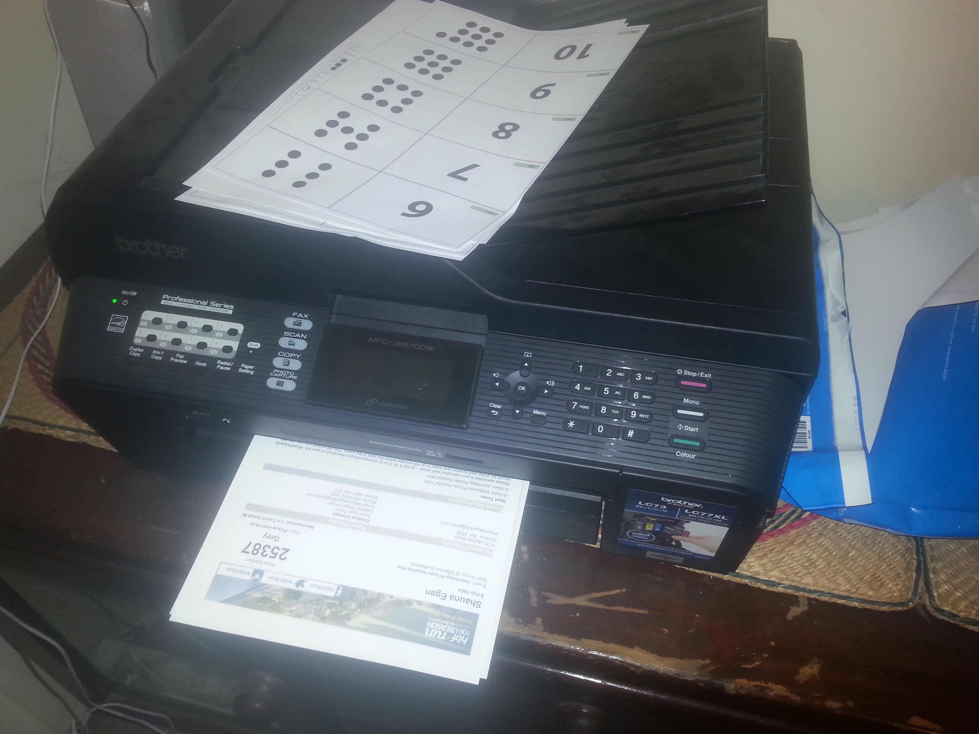
This Brother printer demonstrates aesthetic consistency in an internal way. Expectations of the printer’s systems are created from images used throughout. The most obvious example are the primary functions of print, fax, scan, copy and photo capture each represented by the same images on the outside of the printer and within the system. This consistent use of internal symbols helps users to relate everything within the printer to one of those aforementioned functions. Again this makes everything within the system easier and thus better designed.
Example 3: Ladder

Ladders can represent all types of consistency. On the external and functional sides one can expect a good ladder to be stable and easy enough to climb. Even when items such as ladders come in a variety of designs (as seen in the picture) consistencies such as these often carry over. While internally expectations can come from both aesthetics and functions. For example, it can be assumed each rung is the same length apart for proper safety while climbing up. All these examples on something as simple as a ladder proves the effectiveness of consistent design.
Lidwell, Holden, and Butler state in their article Consistency that when there is consistency in the design and function of a system, that system is easier to use and learn. There are four kinds of consistency: aesthetic consistency dealing with style and appearance, functional consistency which refers to meaning and action, internal consistency with other elements of the system and external consistency with other elements of the greater environment. The article states that these things communicate expectations of trust and recognition with audiences.
This phenomenon is believed to be a continuation of human beings learning from “integrative unity” from early infancy. That is the way one grows to relate to existing variety in the world. Because of a person’s faith in unity, trust is built up through certain things. Fire burns, a parent brings love, falling down hurts etc. This consistency in life translates perfectly to systems.
Designers have most definitely picked up on this. In this saturated world of products and brands aesthetic and external consistency can bring much needed attention and increases the probability of reaching a target audience. Alex Simonson and Bernd H. Schmitt have this to say on the topic:
“Consumers are bombarded with hundreds of visual and verbal identity elements everyday…and since they cannot possibly notice and pay attention to all the manifestations of a corporate or brand identity, they selectively choose to focus on some of them and ignore others. Consistent expressions increase the likelihood of remembering the expressed identities” (Simonson & Schmitt, 1997)
Perhaps the best example of internal and functional consistency in modern times is website design. Recurring elements in many websites such a logos in the top left hand corners or the placement of site navigation has set up a short list of common conventions. When arriving at a new Web site “users need to determine where they are, what they can expect to accomplish, what controls are available, where the content is located, and what other sections and pages are available” (Horton, 2006) and consistent design across the whole web environment is the best way to achieve this.
Some argue that consistency in design is the wrong approach. Jared Spool argues that thinking about user knowledge is a more important issue and that being externally consistent is taking the easy way out. Either way, the power of consistency has been demonstrated time and time again.
Critto, A. (2000). Consistency: Being coherent. Lanham, Maryland: University Press of America.
Horton, S. (2006). Apply a consistent design. Retrieved from Universal usability: http://universalusability.com/access_by_design/page_layout/consistent.html
Lidwell, W., Holden, K., & Butler, J. (2010). Universal principles of design, revised and updated. Minneapolis, Minnesota: Rockport Publishers.
Simonson, A., & Schmitt, B. (1997). Marketing aesthetics: The strategic management of brands, identity, and image. New York, New York: Simon and Schuster.
Spool, J. (2005, September 15). Consistency in design is the wrong approach. Retrieved from User interface engineering: http://www.uie.com/brainsparks/2005/09/15/consistency-in-design-is-the-wrong-approach/
